Kluaq: A Retro-Modern Display Typeface for Digital Branding
There it was—my third revision of the hero section for a boutique coaching site—and something still felt off. The headline needed warmth, personality, and just enough visual spark to stop scrolling without sacrificing clarity. I swapped in Kluaq, typed “Clarity Starts Here,” and instantly exhaled. Not because it was flashy, but because it felt human: playful curves balanced by clean structure, retro charm grounded in modern spacing. That’s when I knew this wasn’t just another display font—it was a tone-setter.
What Kluaq Brings to the Screen (Beyond Looks)
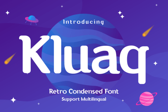
Kluaq lives firmly in the display font category, designed not for paragraphs but for moments that matter: headlines, section dividers, call-to-action buttons, and branded graphic elements. Its retro-modern personality comes from subtle quirks—a slightly exaggerated x-height, rounded terminals with gentle tension, and letterforms that nod to mid-century signage without leaning into kitsch. It’s fun, yes—but never at the expense of professionalism. On a product landing page, it signals approachability. On a portfolio homepage, it hints at creative confidence. And on a course sales page? It quietly says, “This isn’t generic—you’re in the right place.”
Real Layout Testing: Where Kluaq Shines (and Where It Doesn’t)
I tested Kluaq across real scenarios: a mobile-first coaching site header, an image-overlay banner for a digital brand kit, a CTA button on a blog newsletter signup, and a testimonial accent line inside a card layout. Here’s what held up:
- Hero headlines — At 48px+ on desktop and 36px on mobile, Kluaq maintained crispness and character even with light tracking. No blurring, no hinting issues—even on lower-DPI Android devices.
- Image overlays — Over soft-focus background photos, its strong contrast and open counters kept text legible without heavy drop shadows.
- Branded graphic elements — Used as a decorative accent in SVG icons (e.g., “Workshops” inside a minimalist badge), its shapes scaled beautifully and retained charm at 24–32px.
But it’s not universal. I tried Kluaq for navigation labels at 16px—too tight, too decorative. Same for form field placeholders and small footer links. And while its uppercase styling works brilliantly for short banners (“New Launch,” “Join Us”), it’s not built for body copy or dense feature lists. That’s not a flaw—it’s intentional design discipline.
Pairing It Right: Harmony Over Contrast
Kluaq thrives when paired thoughtfully. My go-to combo? Kluaq for headings + Inter UI (or a similar neutral sans serif) for all supporting text. Why? Because Kluaq’s personality needs breathing room—not competition. I avoided overly ornate scripts or high-contrast serifs, which clashed with its balanced playfulness. For a more editorial feel—say, a writer’s portfolio—I tested it with a warm, low-contrast serif like IBM Plex Serif—and it worked, but only for H1s and pull quotes. Anything denser overwhelmed the rhythm.
The key is hierarchy: let Kluaq own the emotional hook, then hand off clarity and scanability to your workhorse font. That balance makes users feel both welcomed and guided—not distracted.
Technical Notes Every Web Designer Should Check
Before dropping Kluaq into a live project, I verified several practical details:
- Webfont formats — It includes WOFF2 (ideal for performance) and WOFF, plus OTF/TTF for design mockups. No variable font axis yet—but solid weight options (Regular, Bold, and a thoughtful Italic that retains legibility).
- Licensing — The commercial license explicitly covers website use, client projects, SaaS dashboards (as UI accents), and digital templates—no hidden restrictions for online stores or course platforms.
- Language support — Covers Latin-1, basic Latin Extended-A, and common diacritics—enough for English, Spanish, French, German, and Portuguese sites. Not ideal for full multilingual CMS builds without testing edge cases.
- Alternates & OpenType features — Includes stylistic alternates (like a friendlier lowercase “a”) and standard ligatures—subtle, but meaningful when activated via CSS
font-feature-settingsfor polished touchpoints.
Making It Work Responsively—Without Compromise
One of my favorite discoveries? How well Kluaq adapts to responsive scaling. Using clamp(2rem, 4vw, 3.5rem) for H1s, the font preserved its proportions across breakpoints—never too chunky on mobile, never too delicate on large screens. I also added modest letter-spacing (+0.03em) at smaller sizes to keep counters open, especially over busy backgrounds. And crucially—it passed WCAG AA contrast checks against both light and dark backgrounds when used at recommended sizes (≥24px for primary headlines).
It’s not a “set-and-forget” font—but it rewards intentionality. Adjust tracking, respect size thresholds, pair wisely, and test on real devices. Do that, and Kluaq becomes more than decoration: it becomes part of your site’s voice.
When to Reach for Kluaq—And When to Pause
Reach for Kluaq when you need to:
- Add warmth and distinction to a hero section or campaign banner
- Signal creativity in a portfolio, studio, or maker-focused brand
- Elevate a CTA button or limited-edition offer without shouting
- Unify visual language across web graphics, social previews, and email headers
Pause before using it for:
- Body text, navigation, form labels, or any UI element requiring fast scanning
- Accessibility-critical interfaces where consistent letterform recognition matters most
- High-density dashboards or data-heavy pages where neutrality supports comprehension
Kluaq doesn’t try to do everything—and that’s why it does its job so well. It’s a focused tool, not a Swiss Army knife. And in today’s web landscape, where authenticity and intentionality drive connection, that focus is exactly what many digital brands have been missing.